
Auction Advertising Tips from the World’s Best Beach
This is the first of two posts about advertising strategies from resort areas.
 —
—
I’m writing this post next to a pool at a resort where suites can cost more than $1,100/night. We didn’t stay here. The front desk clerk made an exception for us to chill by the pool, while we waited for our flight home. The fact of the matter: most of Grace Bay Beach is too rich for my blood, definitely for my budget.
As expected, Sotheby’s International Realty has an office here. Almost all of their Turks & Caicos listings have two commas in the price. (Their current halo property on the island is listed at $45 million.) For properties like those in premium locations like this, there’s a lot you could say—headlines and bullet points for days. In a wall rack full of tantalizing property brochures, though, there were none. No headlines. Every brochure cover looked identical, save for a different image, property name, and location.
No. Other. Details.
I was in the agency’s office probably fewer than ten seconds, including the time it took to choose and pull the property brochure that appealed most to me. I made that choice in much less time than someone who is actually shopping for a house here would spend, but the sorting process works the same.
I don’t need a headline, if that picture doesn’t grab me. If that beautifully-photographed house isn’t where I want to live, it doesn’t matter what kind of kitchen it has or how many acres come with it.
 Sotheby’s and its agents don’t sell the kind of assets you need to be convinced are valuable. They trust that their clientele knows what they want when they see it.
That’s true, whether the asset is a $3,600,000 home or a rental house, a $350,000 combine or a twenty-year-old manure spreader, Marilyn Monroe’s $4,800,000 dress or a collection of Beanie Babies. While consumers might have to be convinced of a price point, they already know whether something appeals to them or not.
Most small business marketers, especially auctioneers, don’t trust their photos to sell the assets at hand. If they did, we designers in the industry wouldn’t be using 6pt and 8pt type on direct mail for text that should be on our clients’ websites. If photos were appropriately valued, I’d get more professionally-shot images for the job orders that come with “we’d like this to be an award-winner.”

Interestingly enough, when I was on Instagram the day after I grabbed this brochure, this is the listing that showed in the ad—even though I didn’t visit their website.
No matter what the rent is where you live and for what you sell, the lessons for all of us from a brochure rack in the Caribbean include:
• Use large, singular images for first impressions.
• Include minimal text on those panels.
• Relegate text to the edges of images or in adjoining frames.
• Understated fonts and layouts communicate premium value.
I flashed the brochure to my wife as we walked toward the pool. After a quick glance she said, “You don’t have to say much when you have pictures like that.”
“No. No, you don’t,” I answered. And neither do you.
—
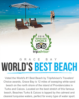
Feature image from Sotheby’s listing page for this property.
—